Project developed while as was an Art Director at Omedia Paris
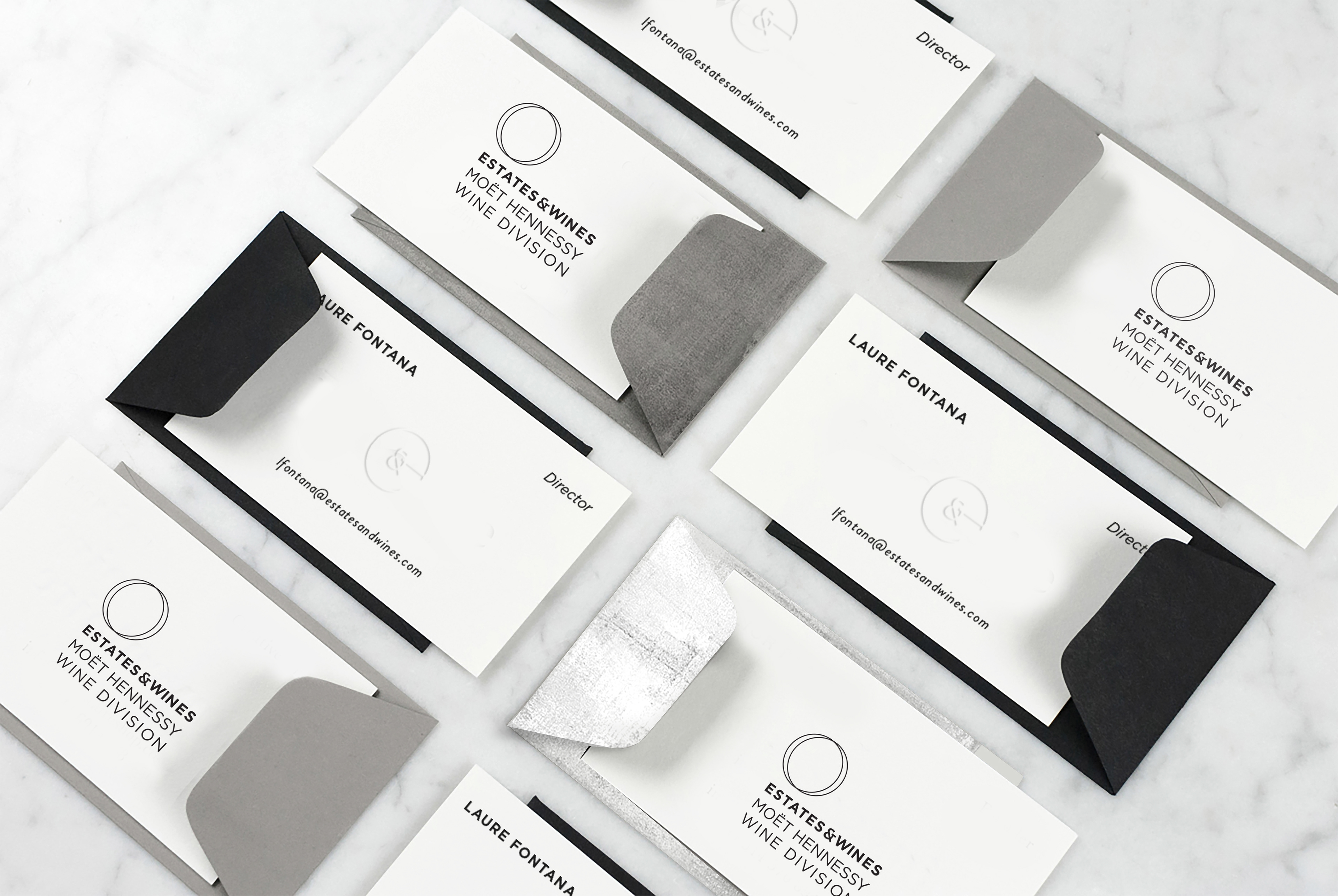
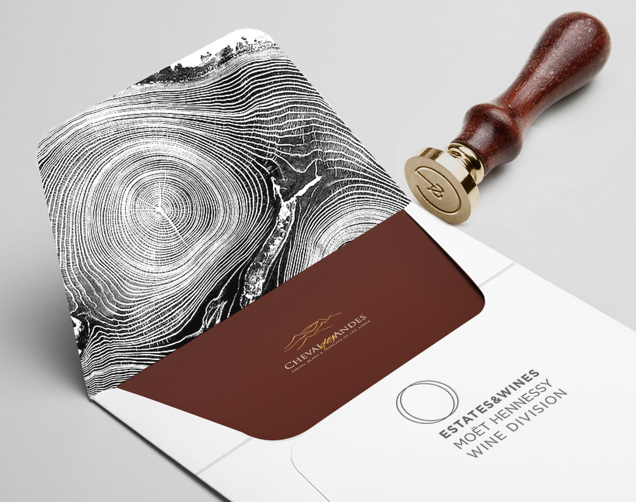
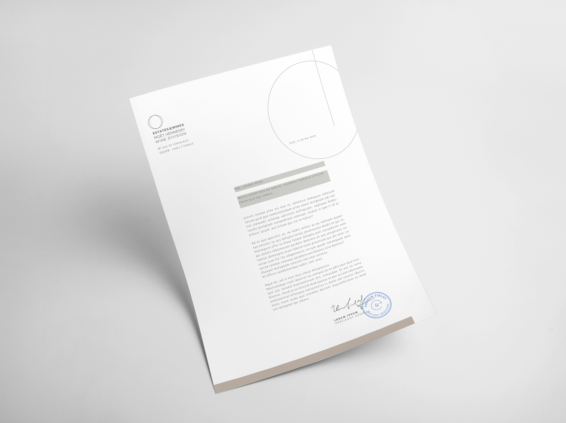
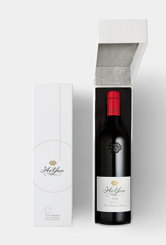
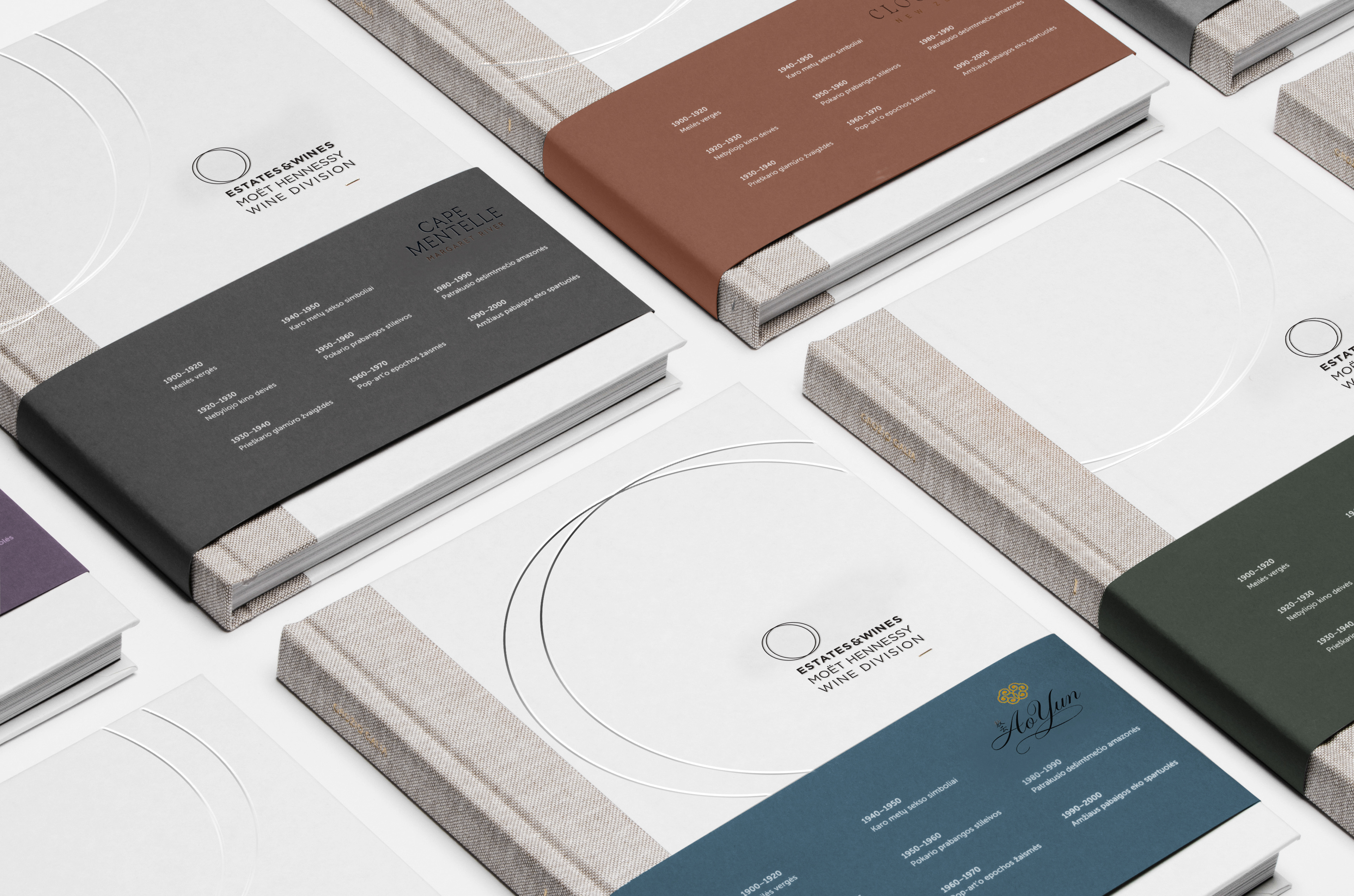
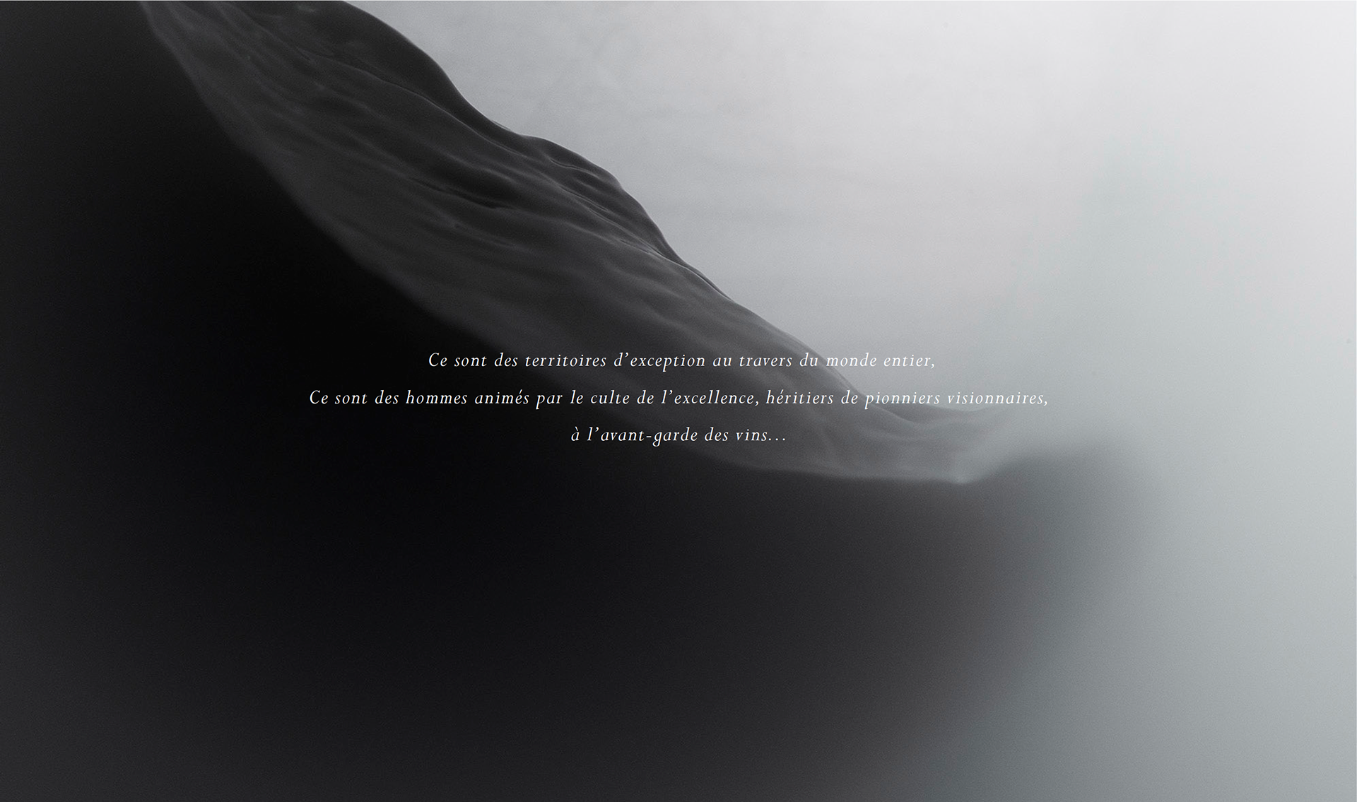
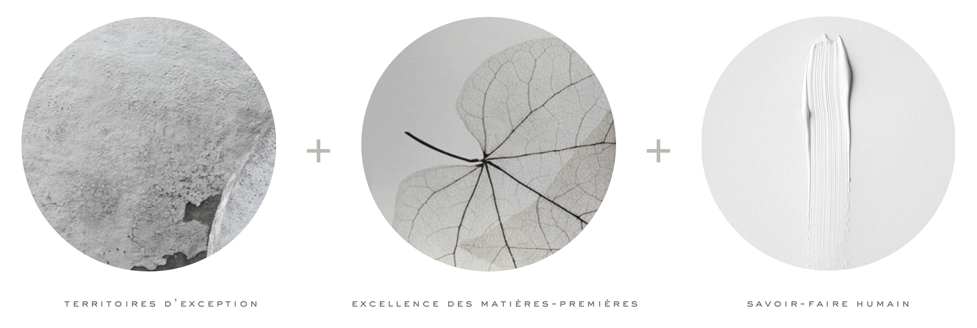
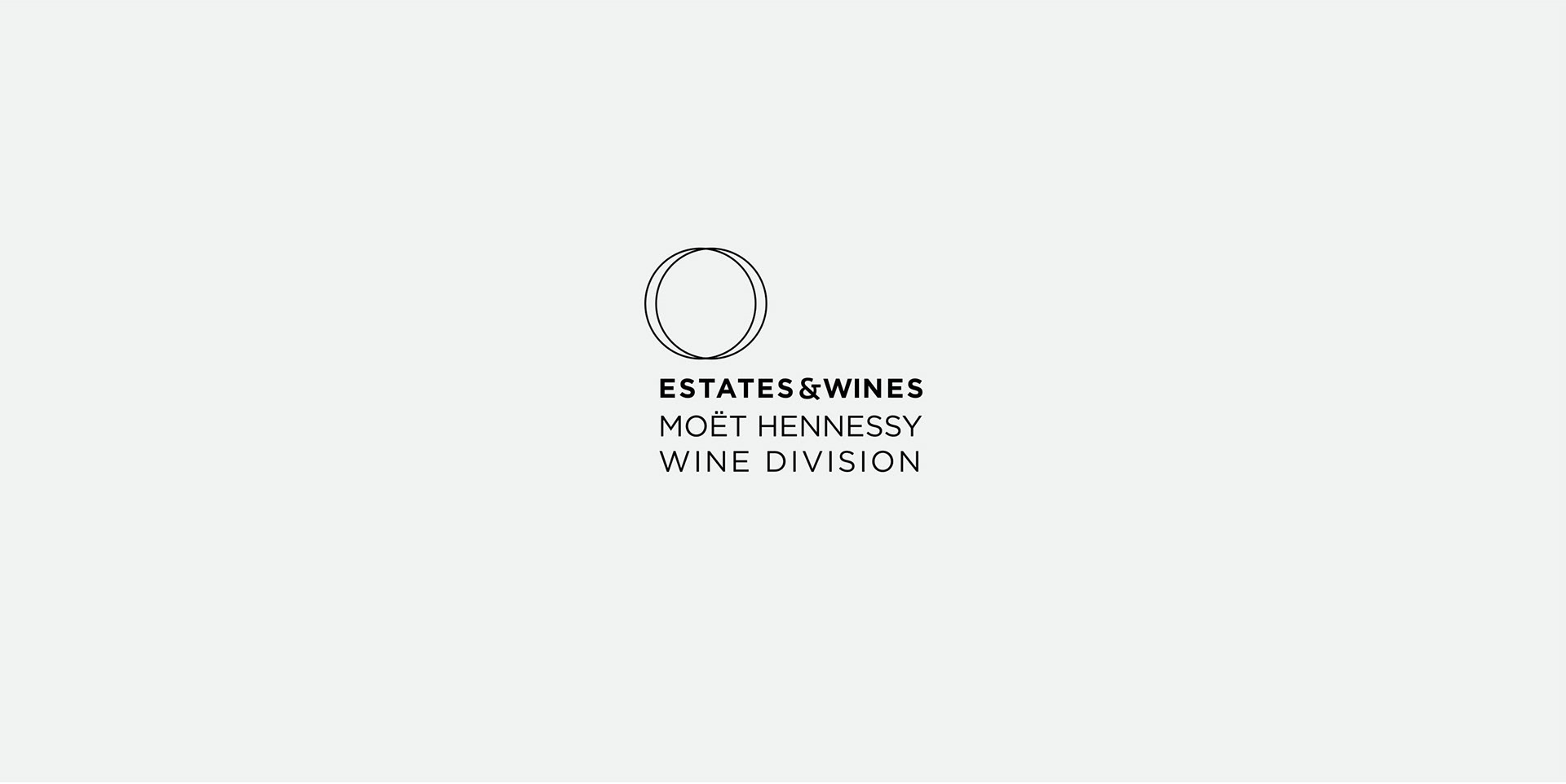
Moët Hennessy asked for a complete visual identity for their international division: Estates & Wines. The two circles are an extrait of the two dots sign in “moët”, meaning that E&W shares the same DNA as its mother brand. The overlapping of the circles represents the E&W’s vocation of bringing together wines of different terroirs all around the world.
For their final rebranding, the client decided to keep a logo based only on typography, but the proposed visual codes remained.
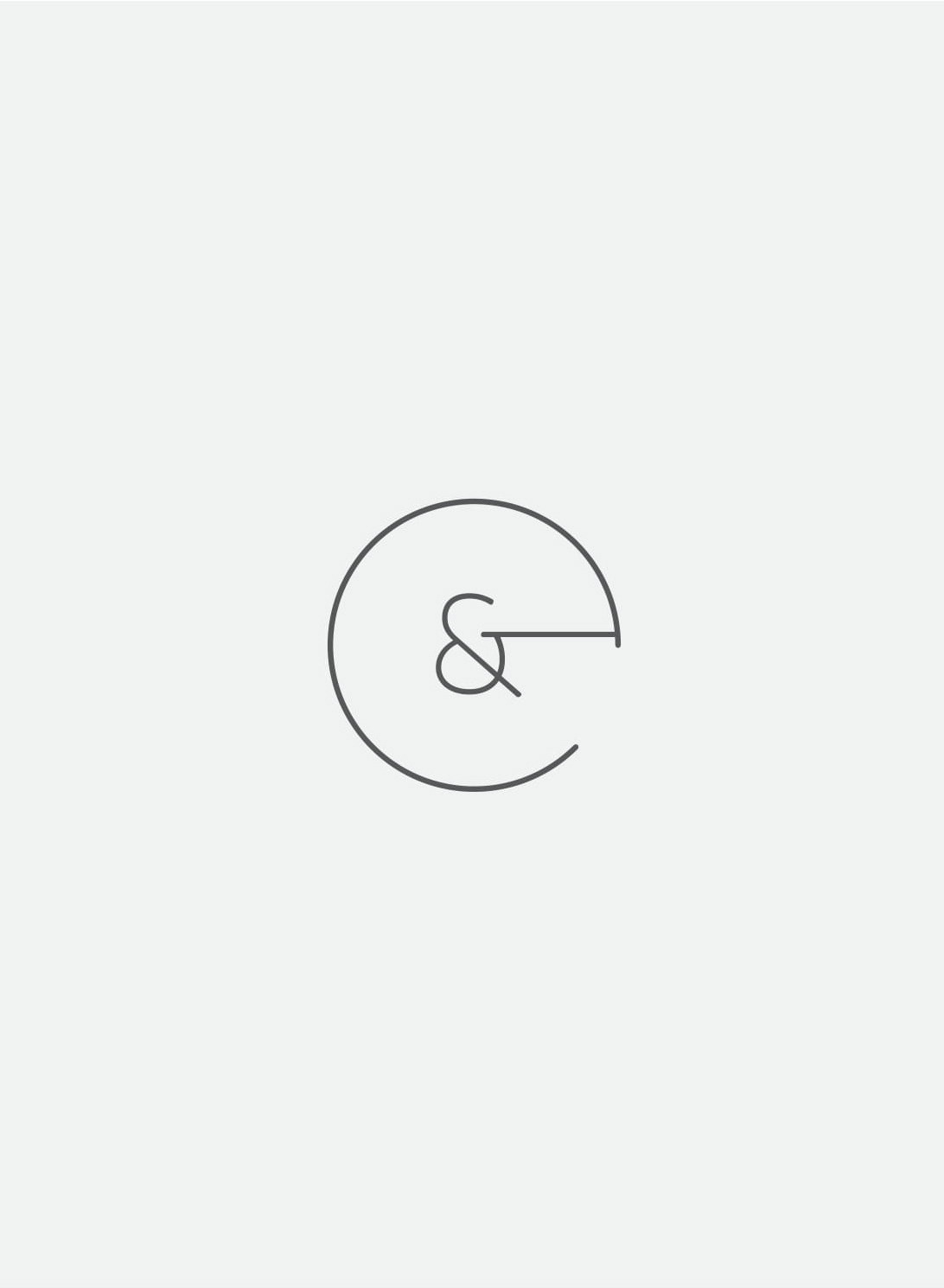
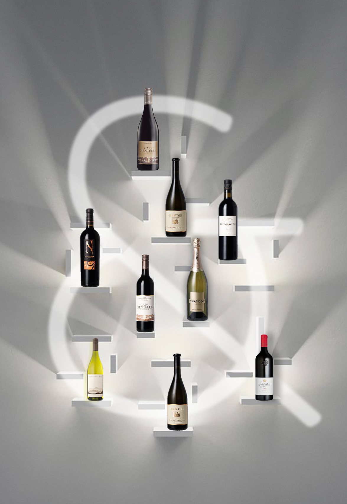
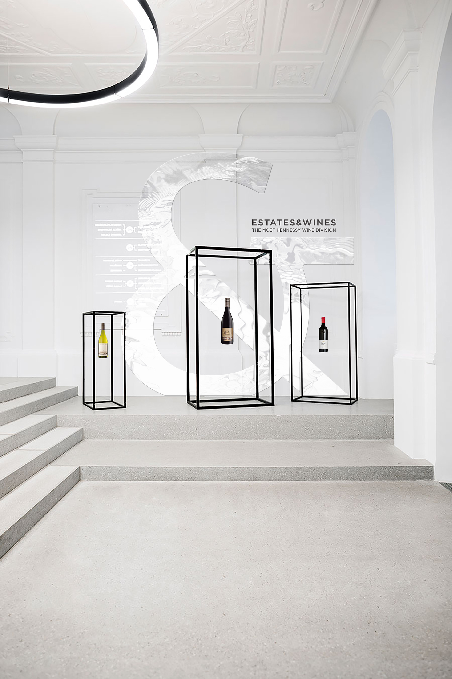
The brand symbol (above) keeps the main identitary elements of the logo - thin lines, circles - and highlights the ampersand.
An stylized ampersand was the symbol adopted by the brand previously. It conveys a sense of togetherness that perfectly sums E&W mission. By referencing the brand's past history, we propose a future rooted in heritage.
An stylized ampersand was the symbol adopted by the brand previously. It conveys a sense of togetherness that perfectly sums E&W mission. By referencing the brand's past history, we propose a future rooted in heritage.